Color Grading with Curves
Color grading is what gives a movie its mood. The teal-and-orange look of a thousand Hollywood blockbusters, the desaturated greens of a thriller, the warm golden glow of a romance: all of these are color grades, applied after the photo or footage was captured. Photoshop's Curves adjustment layer is the most powerful color grading tool you have, and once you understand the per-channel approach, you can match any look you have ever seen.
This tutorial builds a classic teal-shadows / orange-highlights cinematic grade in three Curves layers. Once you know the pattern, you can flip the colors, dial back the intensity, or push it to extremes for stylized work.
The three-layer color grading recipe
Step 1: Add a Curves adjustment layer for shadow split-toning
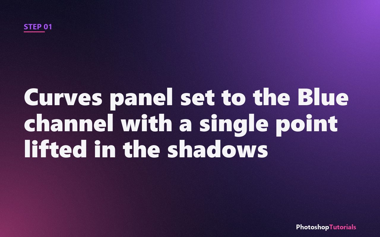
Click the Curves icon at the bottom of the Adjustments panel. In the Curves dialog, change the channel dropdown from RGB to Blue. Click on the curve about a quarter of the way up from the bottom (the shadow region) and drag it slightly upward. This pushes blue into your shadows, giving them a teal cast. Lift it just enough that the effect is visible but not cartoonish.
Step 2: Add a second Curves layer for highlight warming
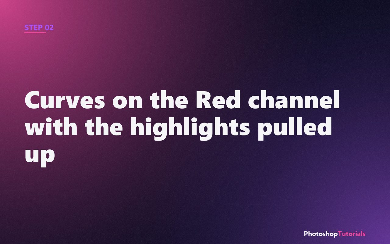
Add another Curves adjustment layer. This time set the channel to Red. Click on the curve about three-quarters of the way up (the highlights) and drag upward. Your highlights now have an orange tint, complementing the teal shadows you just added.
Want a structured Photoshop course?
Tutorials like this one cover individual techniques. A complete Udemy course walks you from selections and layers through retouching and compositing in one structured path. Often on sale from $14.99.
Browse Photoshop courses on UdemyStep 3: Reduce the green channel slightly to lock in the warmth
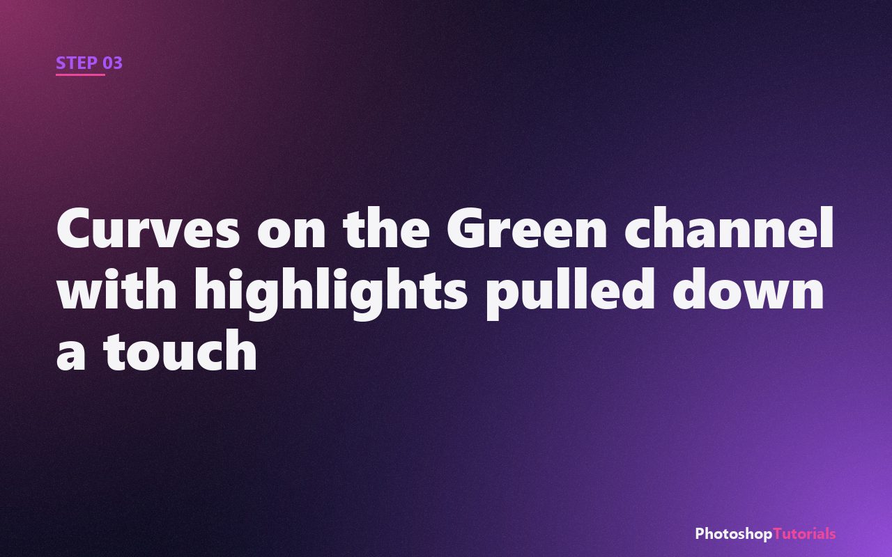
Add a third Curves layer. Set the channel to Green. This time, click in the highlights and pull down just a small amount. Reducing green in the highlights enhances the orange tone you added in Step 2 and prevents the warm areas from looking yellow-green.
Refining the grade
Step 4: Group the layers and lower the group's opacity
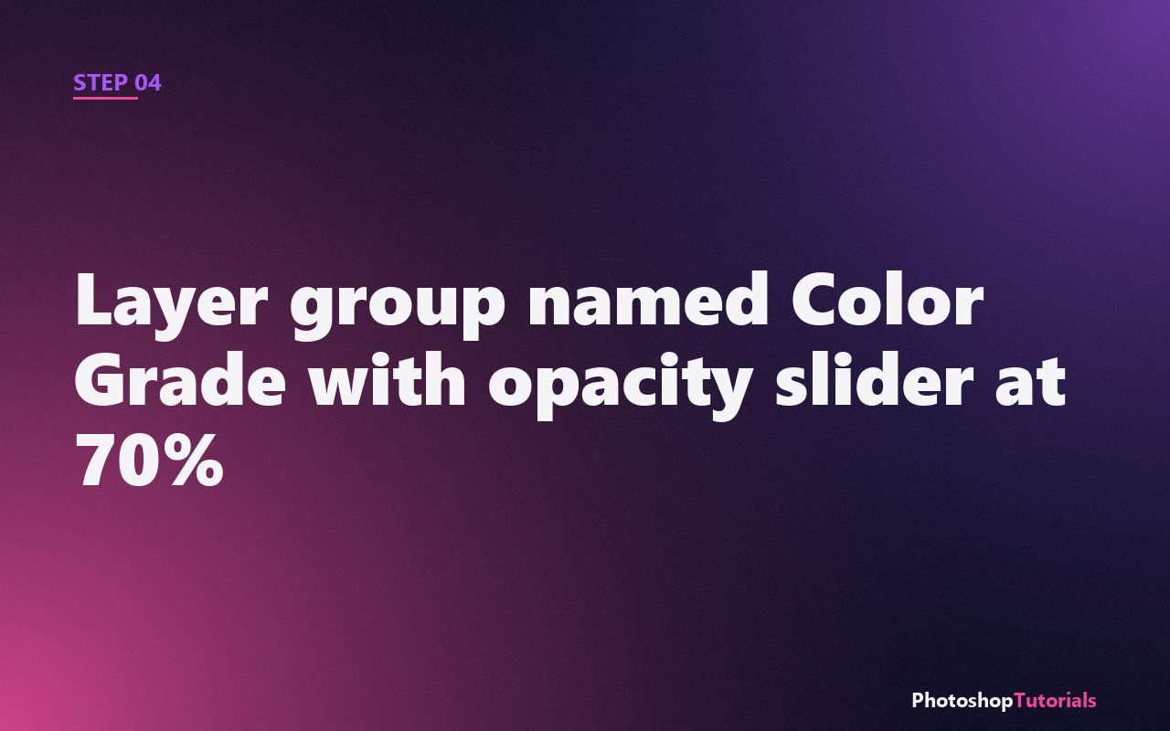
Select all three Curves layers, press Ctrl/Cmd + G to group them, and rename the group Color Grade. Drop the group's opacity to 60-80%. Color grading is almost always too strong on the first pass; pulling the whole group's opacity back gives you a tasteful version of your stronger reference look.
Step 5: Add a subtle vignette
Add one more Curves adjustment layer. Pull the whole curve down slightly. Click the layer's mask, fill it with black (Edit > Fill > Black), then paint a soft white brush over the corners of the image. The vignette pulls the viewer's eye toward the center and finishes the cinematic look.
Pro tip: study the grades you love
Open a still from a movie or photo you love and try to reverse-engineer the grade. Ask: what color is in the shadows, what color is in the highlights, are the midtones warm or cool, is there a vignette? Most grades are simpler than they look. Three Curves layers covers 80% of what you will ever need.
The color grading course we recommend
Domestika has dedicated color grading courses for both photographers and video editors. Worth a look if you want to push beyond the three-curve recipe.
Coming soonWhen to reach for color grading
Color grading is most useful when you need a photo (or a series of photos) to feel a specific way that the raw capture does not deliver. A wedding gallery needs warmth and consistency across hundreds of files. A real estate listing needs cool, neutral, clean. A travel set needs whatever atmosphere matches the place. In every case, the photo as captured is correct, and the grade is what turns "correct" into "intentional."
It is also the right move when you have a mixed-lighting set that white balance alone cannot reconcile. If half your photos were shot under tungsten and half under daylight, a unifying grade is faster than fighting white balance on each frame. Grade them all to the same target and the eye stops noticing the underlying mismatch.
Common mistakes that ruin a grade
Pushing the curves too far on the first pass. Almost every grade looks "right" at 100% and "obviously processed" five minutes later. The group opacity slider at the end of the recipe is not optional. Drop it to 60-70% even if the strong version feels good. Tomorrow you will thank yourself.
Letting skin go green or magenta. Skin tones are the one place viewers consciously notice color shifts, because everyone has a strong internal model of what skin should look like. After the grade, mask out the skin from the most aggressive curve layer (paint black on the layer mask over faces and hands) so the grade tints the world but leaves the people alone.
Ignoring midtones. The recipe in this tutorial works the shadows and highlights and leaves midtones unchanged, which is correct for most cinematic looks. But if your photo lives mostly in the midtones (a foggy day, a soft studio portrait, an overcast landscape), a shadow-and-highlight grade will not move the image enough. Add a fourth Curves layer that targets the middle of the curve specifically.
Adapting the recipe to your style
For a desaturated thriller look: keep the teal in shadows, but instead of warming highlights, pull the highlight curve on the Red channel slightly down. The result is cool throughout, with the contrast of teal shadows against gray-blue highlights.
For a warm romantic look: skip the shadow split-tone entirely and just warm the highlights and midtones. Add a soft Curves layer on the master channel that lifts the bottom point off zero (lifted blacks), which gives you that hazy, late-afternoon-light feeling.
For consistent batch grading: save the entire grade stack as a Layer Comp, or better, export the Curves adjustments as a Photoshop Action. Drop the action on any new photo and the recipe applies in one click. For Lightroom users, the equivalent is a develop preset built from the same per-channel curve points.
Frequently asked questions
Why Curves instead of Camera Raw's color grading panel?
Camera Raw's color grading panel is good and works as a starting point, especially if you live in Lightroom. Curves win when you need precision (specific tone-range targeting), surgical control (one channel at a time), or non-destructive layers you can mask and group. For final delivery work, Curves is the more powerful tool.
Why not just use a LUT?
LUTs are pre-made grades sold or shared as files. They work as a quick starting point. They fall apart on photos that do not match the source the LUT was built on, because a LUT applies the same transformation regardless of the underlying image. Curves let you respond to the photo in front of you, which is why working colorists build with curves first and bake LUTs second.
Does this work on JPEG, or do I need RAW?
It works on both. RAW gives you more headroom in the shadows and highlights before colors break, so heavy grades survive better. JPEG is fine for light-to-medium grades. The recipe in this tutorial works on either.
Can I do this in Affinity Photo or Photopea?
Yes. Both have Curves adjustment layers with per-channel control. The keyboard shortcuts are different, the result is the same.
Related tutorials
Get the Photoshop shortcuts cheat sheet
Every shortcut you'll actually use, on a single printable page.