Double Exposure Effect
The double exposure effect blends two photos into one striking image: a silhouetted portrait with a landscape, forest, or cityscape glowing through it. The look comes from in-camera film photography where two exposures hit the same negative. Photoshop replicates the technique in a way that is far more controllable than the original.
You need two source images: a high-contrast portrait against a clean white background, and a landscape with rich texture. Most tutorials online overcomplicate this. The actual technique is seven steps.
Setting up the composition
Step 1: Open the portrait and remove the background
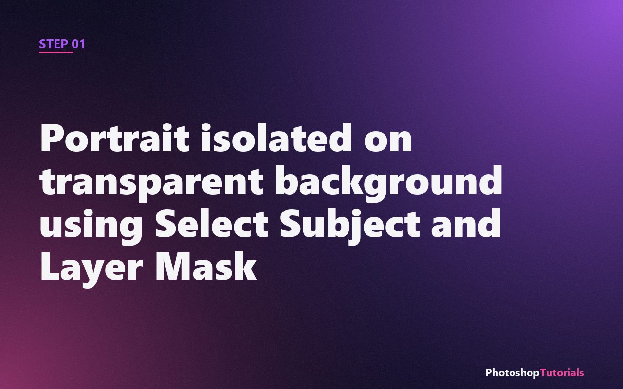
Open the portrait. Run Select > Subject, refine in Select and Mask, output as a layer mask. The portrait should sit on a clean transparent background. (See the remove background tutorial for the full walkthrough.)
Step 2: Add a white solid color fill behind the portrait
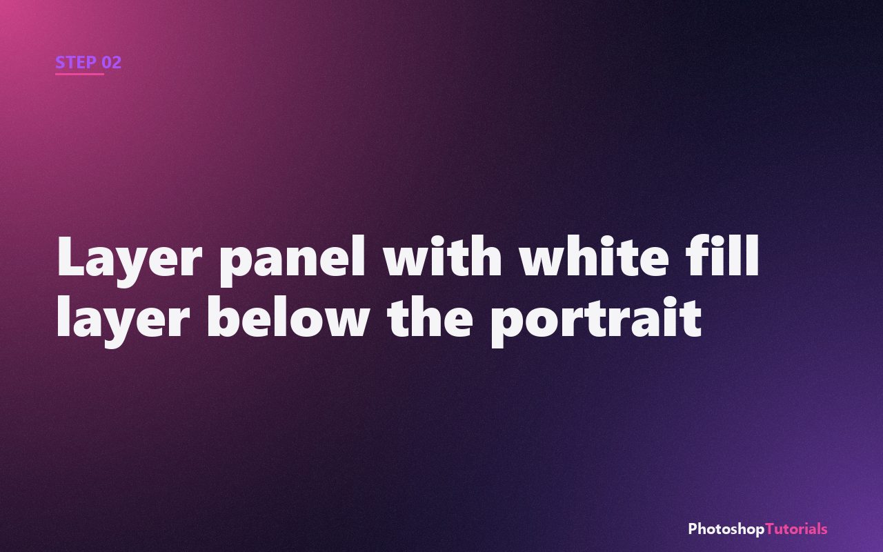
Create a new fill layer (Layer > New Fill Layer > Solid Color) and choose pure white. Place it below the portrait. The white background is essential because it will show through the lighter parts of the landscape later.
Want a structured Photoshop course?
Tutorials like this one cover individual techniques. A complete Udemy course walks you from selections and layers through retouching and compositing in one structured path. Often on sale from $14.99.
Browse Photoshop courses on UdemyWant ready-made double-exposure templates?
Envato Market has premium double-exposure Photoshop actions and PSD templates that produce the look in one click. Useful when you need the result fast without rebuilding from clipping masks.
Browse premium templatesAdding the second image
Step 3: Place the landscape image on top
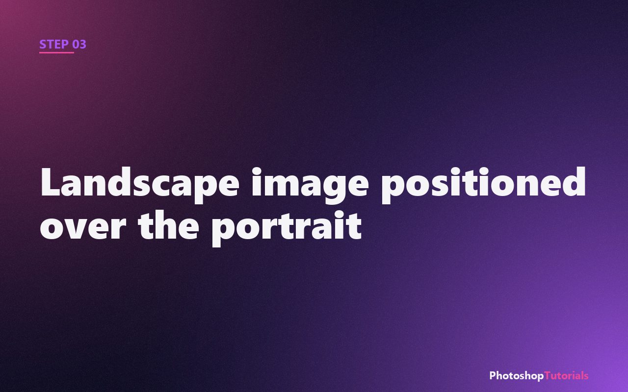
Drag your landscape into the document and place it above the portrait layer. Use Edit > Free Transform (Ctrl/Cmd + T) to scale and position it so the most interesting part of the landscape sits over the face and shoulders of the silhouette.
Step 4: Clip the landscape to the portrait
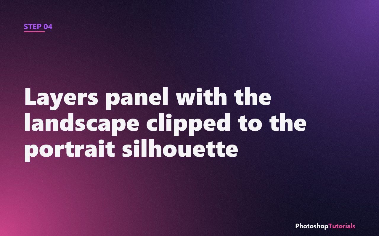
Right-click the landscape layer in the Layers panel and choose Create Clipping Mask (or hold Alt and click between the two layers). The landscape now only shows where the portrait silhouette is. Outside the portrait, transparent.
Step 5: Set the landscape blend mode to Screen
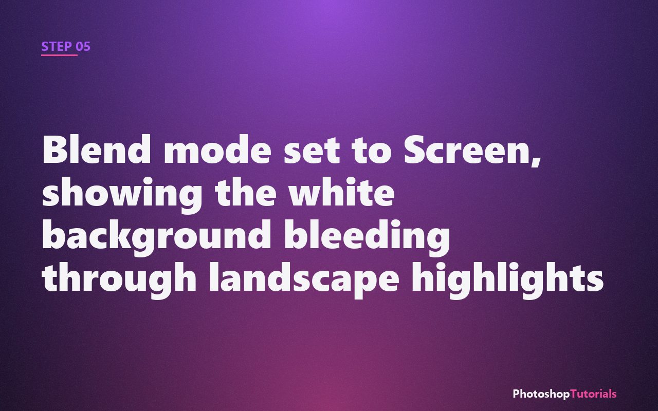
Change the landscape's blend mode from Normal to Screen. The dark areas of the landscape become transparent, letting the white fill below show through. The landscape's bright areas stay opaque, painting trees and sky onto the silhouette.
Polishing the effect
Step 6: Add a Curves adjustment to deepen contrast
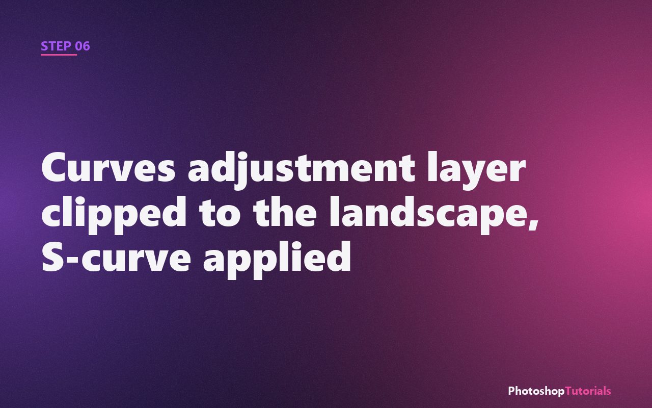
Add a Curves adjustment layer and clip it to the landscape (Alt + click between layers). Apply a gentle S-curve: pull the shadows down, lift the highlights up. This boosts the contrast of the landscape silhouette without affecting the portrait below.
Step 7: Tint the whole composition
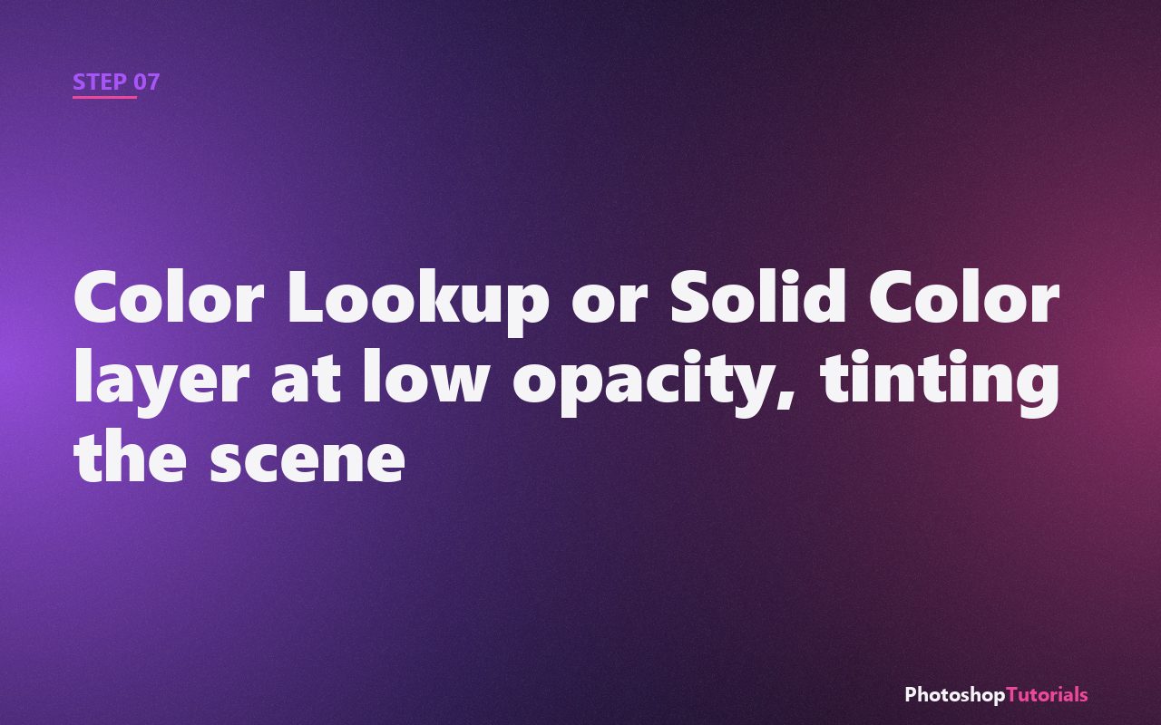
Add a Color Lookup adjustment layer at the top of the stack. Pick a moody preset like "Edgy Amber" or "Crisp_Winter". Lower the layer opacity to about 50%. The unified tint pulls the two photos together so they read as one image instead of two.
Pro tip: choose source images carefully
Double exposure depends on contrast. Portraits with clean silhouettes (clear sky behind, good rim lighting) work best. Landscapes with strong texture (forests, mountains, city skylines) work better than flat scenes (beaches, fields). Sourcing the right photos saves more time than any technique.
The compositing course we recommend
Skillshare's photo compositing courses cover double exposure, surreal art, and advanced blending in depth. Free trial available.
Coming soonWhen the double exposure effect actually works
Double exposure earns its keep in editorial work where the goal is to communicate something about the subject through the imagery layered into them. A musician with a city skyline through their silhouette reads as "shaped by the city." A hiker with a mountain range layered through their face reads as "the landscape is part of who they are." Used with intent, the effect is a visual shortcut to a story.
It works less well for general portraits where the layered image is decorative rather than thematic, because the technique is conspicuous enough that viewers will look for a meaning. If there is no meaning to find, the image reads as a stylistic exercise. That is not always bad, but it is something to be honest about when picking source images.
Common mistakes that flatten the effect
The most frequent mistake is a portrait with insufficient contrast. The technique relies on a clean silhouette to define the shape of the composite. If your portrait was shot against a gray wall with even light, the silhouette is fuzzy and the landscape bleeds where it should not. Fix this in Step 1 by boosting contrast on the portrait with a Curves layer before you mask the background.
The second mistake is a busy landscape. If the second image has too many strong shapes, the composite reads as visual noise rather than a single image. Pick landscapes with one or two dominant elements (a mountain ridge, a tree silhouette, a city skyline) and clear negative space.
The third mistake is skipping the final tint. Without a unifying color layer, the portrait and the landscape look like two photos sandwiched together rather than one image. The Color Lookup step is not optional. Even a faint tint binds the layers.
Adapting the recipe
For a darker, moodier feel: switch the blend mode in Step 5 from Screen to Multiply. The light areas now become transparent, and the dark areas of the landscape paint shadows onto the silhouette. Pair with a deep blue tint for a noir result.
For a triple exposure: repeat the clipping mask and blend mode pattern with a third image (often a texture like film grain, paper, or smoke). Stack it above the landscape, set to Overlay at low opacity. The third element adds tactile depth.
For typography integration: add bold sans-serif type on top of the composite at low opacity (around 30%), blended into the portrait. The text reads as part of the composition rather than as a label, which is how editorial covers stitch type and imagery together.
Frequently asked questions
What kind of portrait works best?
High-contrast headshots taken against a bright sky or a white seamless backdrop. Profile poses (subject facing left or right) read most clearly because the silhouette gives the landscape a strong edge to fill. Front-facing portraits also work but require more careful masking around the hairline.
Can I do this with AI tools now?
Yes, modern generative fills can produce double-exposure-looking results in seconds, but you give up control. The Photoshop method takes ten minutes and gives you total command over which part of the landscape sits where in the silhouette. For commercial work where you need predictable results, the manual technique still wins.
Why does the white fill matter?
Because the Screen blend mode uses the background luminance as part of the calculation. Without the white fill, the dark areas of the landscape would blend against the checkered transparency or whatever happens to be underneath, which produces unpredictable color shifts. White gives Screen mode a clean canvas to work against.
Can I animate this for video?
Yes, in After Effects or Premiere using the same clipping and blend mode principles. The layered structure exports cleanly from Photoshop into After Effects via File > Export > Layers to Files, which preserves the clipping relationships.
Related tutorials
Get the Photoshop shortcuts cheat sheet
Every shortcut you'll actually use, on a single printable page.