Neon Glow Text Effect
A neon glow text effect is one of the most useful tricks in a designer's toolkit. It works for posters, social graphics, music covers, video thumbnails, and YouTube end cards. The recipe is six steps and lives entirely in Layer Styles, which means once you build it you can save it as a preset and apply it to any text in one click.
This walkthrough builds a magenta-to-cyan dual-tone glow on a dark background. Once you have it working, swapping the colors changes the mood without changing the technique.
Setting up the canvas and text
Step 1: Create a new document with a dark background
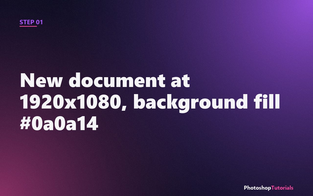
Make a new document at 1920x1080 pixels. Fill the background with a deep navy or near-black (try #0a0a14). The glow effect needs darkness around the text to read; on a white background it disappears.
Step 2: Type your text
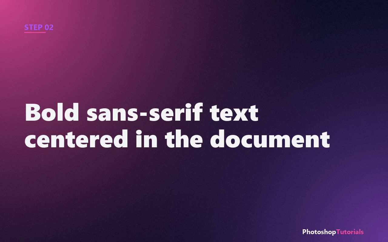
Press T for the Type tool. Pick a bold sans-serif font (Inter Black, Montserrat Black, or Roboto Black work well). Type your text. Set the size to about 200pt and center it on the canvas. Color it pure white for now; the glow will dominate the visible color.
Want a structured Photoshop course?
Tutorials like this one cover individual techniques. A complete Udemy course walks you from selections and layers through retouching and compositing in one structured path. Often on sale from $14.99.
Browse Photoshop courses on UdemyWant ready-made text effects?
Envato Market has hundreds of premium Photoshop text-effect actions, layer styles, and font packs. Useful when you need a polished glow look in seconds rather than building it from layer styles.
Browse premium text effectsBuilding the glow with Layer Styles
Step 3: Add an Outer Glow in magenta
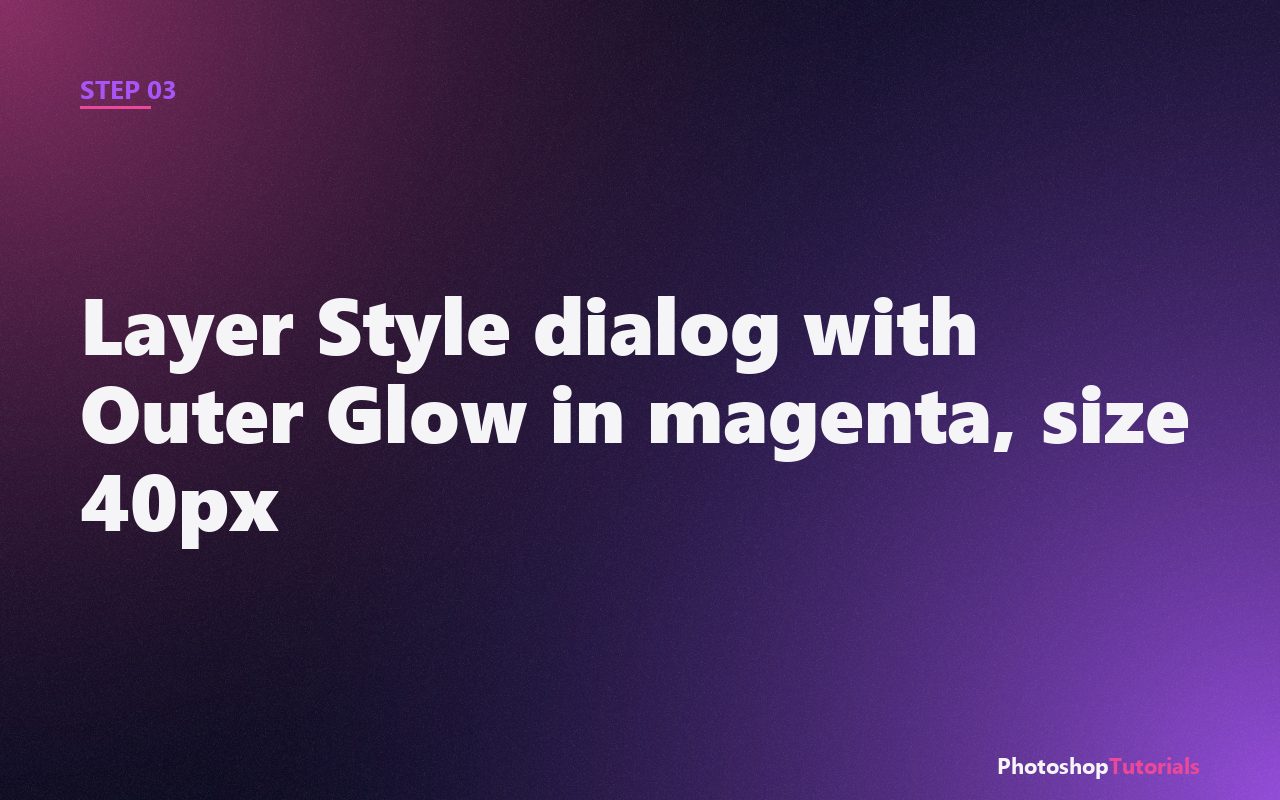
Double-click the text layer to open Layer Styles. Check Outer Glow. Set:
- Blend Mode: Screen
- Color: #ec4899 (hot pink/magenta)
- Opacity: 80%
- Spread: 5%
- Size: 40px
The text now has a magenta halo. This is the inner ring of the glow.
Step 4: Duplicate the text layer and add a cyan Outer Glow
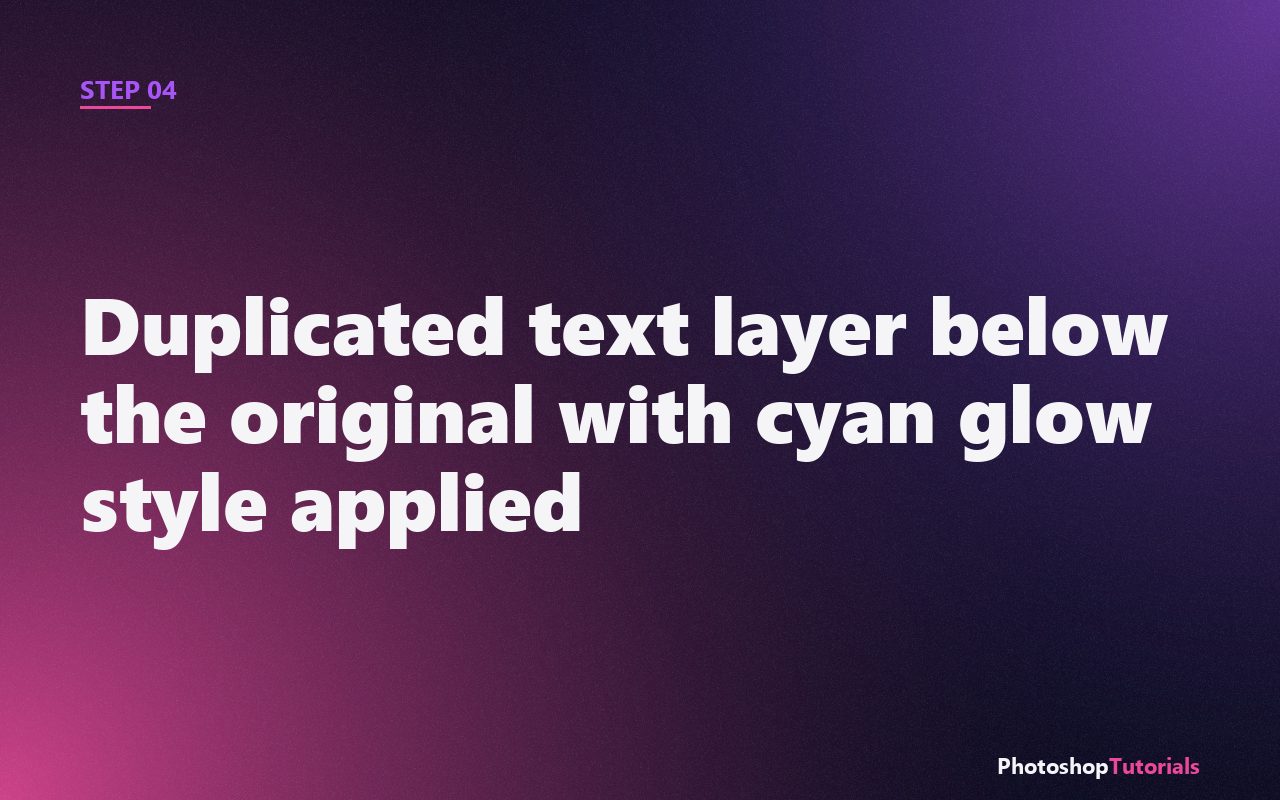
Duplicate the text layer (Ctrl/Cmd + J). Right-click its existing Layer Styles and choose Clear Layer Style. Open Layer Styles again on the duplicate. Add a new Outer Glow with:
- Color: #06b6d4 (cyan)
- Spread: 0%
- Size: 80px
- Opacity: 60%
Move the duplicate below the original. The cyan creates a wider, softer outer ring that surrounds the magenta inner ring.
Step 5: Add a Color Overlay to tint the text itself
Open the original text layer's Layer Styles again. Add Color Overlay. Set the color to a very light pink (#ffd6f0). The text fill now matches the glow color so the whole effect reads as one cohesive light source instead of white-with-pink-halo.
Step 6: Save the effect as a preset
Open the Styles panel (Window > Styles). With the original text layer selected, click the New Style icon at the bottom. Name it "Neon Glow Magenta-Cyan". Future text layers get this look in one click.
Pro tip: glows need atmosphere
For maximum realism, add a subtle blur or noise to the dark background. A real neon sign casts diffuse light onto whatever is behind it. Try a Gaussian Blur filter on a duplicate of the text set to Screen mode at low opacity for a soft halo against the wall.
The graphic design course we recommend
Skillshare's poster and typography design tracks dive deep into text effects, layout, and modern visual design.
Coming soonWhen neon glow text earns its keep
Neon glow text is a go-to for music covers, event posters, podcast cover art, YouTube thumbnails, Twitch overlays, and any social graphic where the goal is to read at thumbnail size on a busy feed. The effect is loud, attention-grabbing, and reads instantly even at small sizes. That is its job, and it does the job well.
It is the wrong choice for body copy, long-form documents, anything that needs to be printed on light paper, or any context where elegance matters more than energy. A 2,000-word essay laid out in glowing magenta will be unreadable in five lines. Save the technique for headlines, titles, and short focal-point text.
Common mistakes that kill the glow
The first mistake is using too many glow colors in one piece. If your headline glows magenta, your subheading glows cyan, and your accent text glows green, the piece looks like a Lite-Brite. Pick two complementary colors per design and stick with them. The magenta-and-cyan combination in this tutorial works because both colors are inside the same visual family (electric, saturated, slightly artificial).
The second mistake is putting glow text on a light or busy background. Outer Glow blend modes (Screen, Add, Linear Dodge) all rely on the background being dark enough to register the bright halo. On a light background, the glow disappears. On a busy photographic background, the glow competes for attention and reads as a smudge. Use a dark, low-contrast background or paint one in.
The third mistake is a font that fights the effect. Thin, decorative, script, or condensed fonts have too little stroke area to carry the glow. Use heavy sans-serif fonts (Inter Black, Montserrat Black, Roboto Black, Bebas Neue). The thicker the strokes, the more surface for the glow to bloom from.
Adapting the technique to your project
For a more cinematic, less arcade look: drop the inner glow opacity to 40% and increase the outer glow size to 120-150px. The result is a softer haze that reads like atmospheric light rather than a literal neon sign.
For an animated version: bring the layered PSD into After Effects with File > Import > File. Animate the inner glow opacity from 0 to 100 in 0.5 seconds for a "neon flicker on" effect. Add a slight position wobble for analog imperfection.
For a print version: the dark background that makes the effect work on screen will look muddy in print. Increase the background brightness slightly (around 10-15% from pure black) so the printer can hold ink density without bleeding. Test with your printer's profile before committing to a full run.
For matching brand colors: replace #ec4899 and #06b6d4 with your brand's primary and secondary hues. The technique is color-agnostic; only the relationship between inner and outer ring matters (complementary or analogous works better than random).
Frequently asked questions
Why does my glow look pixelated?
Almost always because you are working at low resolution or because the Spread slider is set too high. Spread at 5% gives a soft falloff. Spread at 30%+ creates a hard inner boundary that magnifies any pixel jaggedness in the underlying text. Keep Spread low.
Can I do this in Illustrator instead?
Yes. Illustrator's Effect > Stylize > Outer Glow works on the same principle. The advantage of Illustrator is that the result is vector-based and scales infinitely. The disadvantage is that Illustrator's blend mode controls are slightly less flexible than Photoshop's.
Will this work for video output?
Yes. The layered PSD imports cleanly into After Effects, Premiere Pro, and DaVinci Resolve. All three preserve the Outer Glow layer styles. The only catch is that Outer Glow with large size values can be slow to render on long compositions.
How do I save the effect as a preset for future projects?
After Step 6, the style is saved in Photoshop's Styles panel. To share it with another machine or back it up, go to Window > Styles, click the menu icon in the panel, choose Export Styles, and save the .asl file. Drop the .asl on any new Photoshop install to load it.
Related tutorials
Get the Photoshop shortcuts cheat sheet
Every shortcut you'll actually use, on a single printable page.